News
Interview with Michael Van Valkenburgh, FASLA
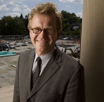 Image credit: Michael Van Valkenburgh Associates
Your winning proposal for the St. Louis Gateway Arch landscape design competition is a vision of “ecological urbanism.” As opposed to preserving wilderness, which you say in the proposal is “neither possible nor feasible in city centers,” the park should instead function in harmony with natural ecologies. What is ecological urbanism? How does a visitor know they are in an ecologically urbanist place?
Let's start by talking about the new buzz words of “ecological urbanism,” and “landscape urbanism,” which can be defined in many nuanced ways, but which are new terms for very old ideas in the field of landscape architecture. These terms are very important to what I like to call the emancipation of landscape architecture. To my mind landscape urbanism is primarily a question of understanding how we go about changing traditional (and formerly architect-directed) urbanism. Ecological urbanism is about city-making that focuses on the landscape elements and their continuity—it’s partly about nature-making in the city, but it is also an approach that adds the sensibility and techniques of ecology as a science to the making and remaking of cities. Similarly, landscape urbanism attempts to shift paradigms from object-based urban design to city-making. It seeks innovation within the interactions of urban systems, identifies opportunities in infrastructure, and sees landscape as much an organizing force as it sees it a distinct facet of the city.
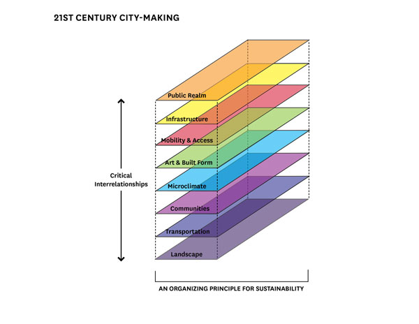 Image credit: Michael Van Valkenburgh Associates
So, rather than seeing the design disciplines as separate, both ecological and landscape urbanism realize a more powerful synthetic approach, more like an ecological methodology. To me, ecological urbanism is an approach that favors dynamic integration between natural and urban systems. In that sense, I would hope that it is not a question of aesthetic recognition alone that defines ecological urbanism but rather a record of measurable improvements in the effect that our cities have on the larger environment and vice versa. This is really a call to arms for rethinking the way we build human environments. This is a time when landscape architects should become leading players.
Aesthetics, of course, are significant in any discussion of urbanism; it is what makes a work of landscape architecture more than just good and distinguishes our work from the pure restoration ecology work that goes on without us. For instance, in UVA professor Elizabeth Meyer’s “Sustaining Beauty,” she points out the need for designers to bring positive ecological approaches to the forefront of our felt experiences, so that it becomes part of what we love in the landscape, not just something we put up with because it is good for us. It would be better if this constant striving for improvements and higher standards with respect to environmental health became so ingrained into our society that we could leave the qualifier “ecological” behind and this would simply be understood as the task of urban design as lead by landscape architects.
This focus on synthesis has led us to an office structure at MVVA that is less top down and more of a collaborative team. Although the leadership at MVVA includes myself and the other firm principals Matt Urbanski and Laura Solano, our 50+ talented coworkers are a heterogeneous set—with degrees from several different schools of landscape architecture, including Iowa State, UPenn, UVA, Cornell, OSU, Harvard, UConn, Penn State, LSU, Illinois, and several others. A good number of our MVVA office colleagues have undergraduate degrees in landscape architecture, but there are also others who have started in the fields of architecture, art, ecology, anthropology, and engineering. Some don’t even have landscape degrees! The hybridity we create through our office’s diverse disciplinary background is fundamental to our ability to lead complex projects in a dynamic and open-ended way.
Pier One, the first piece of the new Brooklyn Bridge Park, just opened to acclaim in New York. The New York Times’ Nicolai Ouroussoff said your design “engages all those aspects of contemporary life with a care and balance that make the park one of the most positive statements about our culture we've seen in years.” What statements do you think the park makes about American culture?
Nicolai’s compliment is as much to the city of New York and Mayor Bloomberg, the state of New York, and the neighborhoods surrounding the park, as it is to our design — but it especially pays tribute to our client, Brooklyn Bridge Park, formerly the Brooklyn Bridge Park Development Corporation, and its three presidents who have guided the park's emergence over the last ten years.
As landscape architects, we aspire to create urban landscapes that become an integral and enriching part of daily life, places that inspire us and are socially rich rather than homogenizing. The goal of our work is to create parks that are intrinsically urban—not places to escape from the city, but places to escape within the city—the very idea is urban. This view is a fundamental paradigm shift from some of the anti-park sentiments of the 1980s, which posited rather ludicrously that we, as a society, had outgrown the need for parks. Whoever thought that either didn't live in a real city or spent every weekend at a country house!
Pier One in Brooklyn Bridge Park is about a new kind of park-making—an act of transformation rather than preservation. The design metamorphosis of the Brooklyn waterfront cannot return anything to a preexisting state of nature, or even simply a pre-urban condition—three hundred years ago the whole of Brooklyn Bridge Park would have been out in the tidal edge of the East River. We are also challenged by land-use decisions of previous generations that we are unable to change, such as Robert Moses' Brooklyn-Queens Expressway (BQE), which now noisily looms above Brooklyn Bridge Park's east side. However, what we can do is use park programming, innovative marine engineering adaptations, and shifts of scale—plus a bold design—to bring the Brooklyn Bridge Park into a new balance with the colossal scale of the surrounding man-made: the BQE, the Brooklyn Bridge, the whole of lower Manhattan across the river, and of course the breathtaking sweep of New York Harbor.
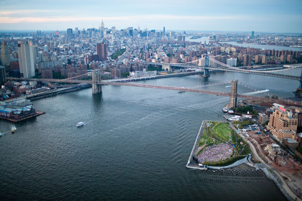 Image credit: Alex Maclean
This balance between nature and humanity is generated by the fundamental belief of my practice, which is to create places where people feel embraced, welcomed and comfortable, to make areas for landscape as program, and to always think of landscape as places of activities. The message of the Brooklyn Bridge Park design and the culture of American cities is that we are learning to be more inventive within a diverse set of constraints and more pluralistic in the way that all groups of people are afforded the kinds of park uses that are meaningful to them. This resourcefulness in defining new parklands has required that we at MVVA venture into unfamiliar territories and create designs that encompass engineering and material science, while integrating methods of ecological restoration and the metrics of brown field remediation. For us, it has been a two decade progression of making urban parks all over North America on sites that once would have been judged as either marginal or even impossible for a park landscape. Today, designers are left with the scraps of the city more often than not (abandoned piers, land that violently floods, interstitial leftovers next to roaring highways…the list goes on!), but there is a liberation that comes from these challenged places—and these project sites are some of the most challenging and the most exciting for us.
Sustainability is a major feature of the new pier-based parks. How did the decision to reuse the old pier infrastructure as the basis of the new parks come about? What’s the history of using piers as parks?
Pier Infrastructure is just one of dozens of sustainable aspects of our firm’s recent designs in New York, Toronto, Chicago, St. Louis and elsewhere. At Brooklyn Bridge Park, the decision to reuse the piers was made only after we had investigated all the underlying metrics of the site, including the existing structural capabilities of the piers, the possible need for expensive structural repair, and what the tradeoff would be for using money for invisible infrastructure or for tangible park spaces. It quickly became clear that the best way to maximize the footprint of the park was to reuse the existing pier infrastructure as much as possible--often with some structural upgrades but not wholesale rebuilding of the piers. (Pier One is unique in that it is not pile supported pier deck, but rather sheet pile supported landfill). The rebuilding of marine edge structures can be expensive, but if we had torn down and rebuilt the piers—as was done at Hudson River Park in Manhattan—the likelihood was that we would have used the lion’s share of the budget in the first stage on infrastructure.
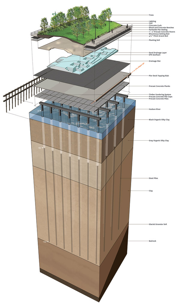 Image credit: Michael Van Valkenburgh Associates
Having decided to keep the piers, we found that the site and the various piers were uneven in their structural capacity, so we made our initial broad-brush programming suggestions based on a pairing of structural economy with the weight of the landscape that was needed to accommodate the programs. We asked ourselves how we could get the most programmatic use out of every area of the park with the least possible expenditure. We placed lightweight things on piers and heavier things on firm ground.
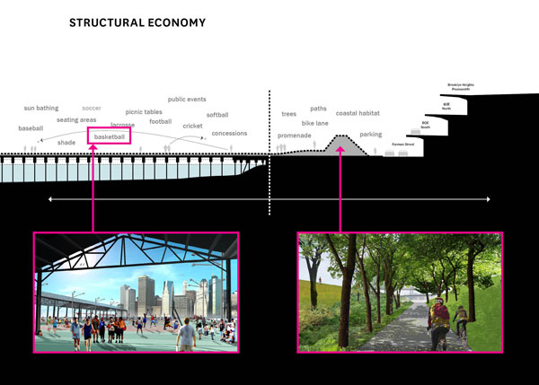 Image credit: Michael Van Valkenburgh Associates
There is a long urban history of piers becoming dedicated or ad hoc public spaces—frequently they were built as standard piers and have since been programmed with food concessions, games, rides, etc. These recreational piers demonstrated the success of the constructed waterfront as a powerful place and a social draw in its own right, not just a location for loading and unloading cargo. However, they weren't necessarily addressing all of the programmatic needs that we generally associate with the word “park”. As landscape historian Ethan Carr recalls from his childhood growing up in the West Village of New York City, the West side piers were places of activities of all kinds long before Hudson River Park was planned and built.
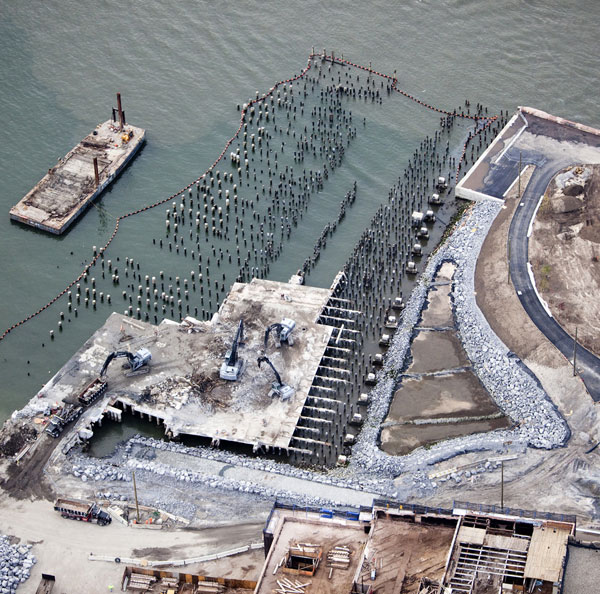 Image credit: Alex Maclean
Your master plan for the Brooklyn park system calls for creating “post-industrial nature” on the site, and establishing functioning ecosystems where there was once asphalt and warehouses. Part of this includes the new salt marsh that just opened. Did you accomplish all you planned to in reintroducing natural habitat? If not, what obstacles limited the vision?
When discussing our introduction of nature to urban sites, we have to look not only at each new element, but also at how the ecosystem as a whole interacts with the other aspects of the park. At MVVA, we prefer designs that are more like collages of activity, seeking a mix of program and treating the ecological pieces as park program as well. In Brooklyn, we analyzed the condition of marine structural edges and where they were badly deteriorated we didn't replace them per se, and in a sense they became part of our collage—using some of these areas as places of created nature or opportunities to allow water access for kayaking. The purpose of a park is to serve people by thinking of every bit of the parkland as fulfilling a user’s need—even quiet scenery should be recognized as satisfying a need; but these purposes can be achieved, or assembled spatially, in many different ways. Our vision of what constitutes a successful habitat restoration is different from what a restoration ecologist might aspire to. To that end, I'm pleased with the extent to which we have been able to introduce thus far with these new ecologies along the Brooklyn waterfront—and the salt marsh is one of the best moments in the whole design. A drop dead gorgeous urban moment with a field of piers registering the tide nearby and the Statue of Liberty far across the harbor...and last week I saw a great blue heron there!
The Wellesley campus valley you restored turned parking lots into wetlands. Toxic soils were lined and stored, creating new mounds that mimic the original landscape. What are the challenges involved in working with toxic soils if you are trying to create a natural habitat?
The mounds are references of sorts to glacial formations, such as drumlins and eskers, which exist in the New England landscape, but are not at all a direct representation because there were never mounds in this wetland to begin with, nor do they have the formal configurations of the mounds native to this landscape. The placement, height, and slopes of our landforms serve an important programmatic purpose—to allow us to pile and contain the mildly contaminated soils—but we also chose to exaggerate topographic qualities that are already there as a means of creating a visual and spatial sequence as one walks throughout filtering marshes to the edge of Lake Waban. Through this exaggeration of naturalism, you can recognize that the mounds are human made, but this creates a sense of experiential drama that makes the place feel powerful while also belonging to where it is.
I suppose a comparison might be to painters who might take a certain signature element of their subject—for instance a beautiful woman's long neck in the case of modernist Amedeo Modigliani—and call attention to it by overstating it a bit. We've been using the term “hyper-nature” for years now to describe this element in our work from the vegetal perspective, and the Alumnae Valley landforms definitely fall into this category as landscape forms and circumstances that seem both familiar and a bit uncanny at the same time. The ambiguity, we hope, is a part of the charm, just as the ice wall in Teardrop Park evokes the physical power of geology and plate tectonics without attempting to hide its origins as a constructed object.
When working with toxic soils, regardless of whether you are looking to recreate natural habitat, it is always a question of either containing or removing the toxicity. Almost none of the toxic soils were removed from Alumnae Valley. The mildly contaminated soils used to make the valley mounds were excavated as part of the construction of an underground garage nearby. Toxic soils always represent a huge challenge because of issues of responsibility and cost for handling and moving. Clearly you cannot ignore toxic soils, as they are likely polluting the groundwater. You also cannot (or should not) ship them away, because then you are merely relocating the problem. Yet, treating them onsite is a slow, arduous, and expensive process.
At Wellesley we adopted different measures for different aspects of the brown fields, each of which represented an aspect of the college’s desire to take responsibility for this particular part of their legacy. The overlapping areas of contamination required multiple remediation strategies, including isolating toxic soils and safely reusing them onsite and establishing a long term pumping system to draw out toxic matter that had settled in the site's original peat layer. Although the soil pollution and stormwater treatment were separate issues, the landscape design addresses them simultaneously. Using soils from the excavations for the garage and the student center, the new landscape is elevated, on average, six feet higher than Lake Waban, allowing site runoff to bypass the worst of the soil contamination caused by the coal gasification plant while the pollutants are pumped out.
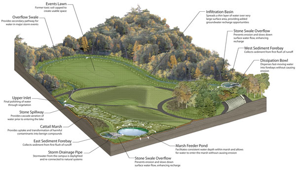 Image credit: Michael Van Valkenburgh Associates
In some of your smaller projects, you've highlighted the textural qualities of simple natural materials, creating sustainable and meditative spaces. In “Small is Beautiful,” a landscape for an office for the fashion designer Elie Tahari, there are moss and black locust log planks. “Passage to the Lake” features simple concrete bridges and wooden log steps set within the landscape that also look fun to walk on. What's the connection between sustainability and meditative spaces?
We experience landscape through what we see and smell and feel. The sensual aspects of landscape are what I care most deeply about in our medium. Materiality is therefore crucial to my firm's work; we design with specific materials in mind and we oversee the building of all of our projects in order to safeguard but also modify our original ideas about how things will feel in daily use. I cannot overstate the care we take to use materials to build landscape experience in subtle and unique ways. We are material geeks and we embrace our inner nerds when it comes to the elegant transformation of engineering to design. That being said, I believe the connection between sustainability and meditative spaces exists and is crucial. It is a belief that has been so fully absorbed in who we are that it colors our reactions to experience rather than generating a purely intuitive response to sustainable approaches. There is a lot of satisfaction in knowing that a landscape makes positive ecological contributions, and there is a richness to natural materials and native habitats that buzz with life, but it is also important to be sure that the design doesn't foster a complacency that looks for nothing other than a beautifully stylized landscape.
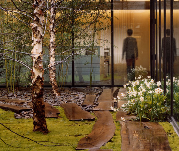 Small is Beautiful. ASLA Professional General Design Award, 2006. Image credit: Elizabeth Felicella
To the degree that there can be a sense of intrinsic rightness about a place (it should feel inevitable and this idea is terribly important in our work), I think that it often as to do with the elegance of the solution, with “elegance” understood in the way that engineers or mathematicians use it, to indicate an ingenious simplicity. When we say that design continues through all phases of our work, we mean this specifically in terms of how the elegance of our work is materially realized all the way through construction phase decision-making, often with in-the-field adjustments during the building process that fine tune what we ultimately make and how it is experienced.
Throughout the realization of a project, some of the most important measures we take with respect to sustainability are not based in technology or material selection but instead have to do with looking for opportunities to be resourceful and allowing this to become an integral part of the felt experience of a place. I think that people can sense and appreciate this frugality when they see—and feel—our landscapes. People tell me that they like our projects even more once they have seen them in person.
Resourcefulness gets to the essence of what sustainability is all about. So it is really the means by which form, materiality, and larger aspirations can come together, hopefully in a way where people leave our landscapes feeling as though they have experienced something wonderful. Designed landscapes, whether big or small, are ultimately about making the everyday lives of all people richer, fuller, and healthier.
Michael Van Valkenburgh, FASLA, is principal of Michael Van Valkenburgh Associates. His firm recently won the international competition to redesign the grounds and surrounding urban circumstances of the St. Louis Arch. He won the National Design Award in Environmental Design from the Cooper-Hewitt National Design Museum in 2003 and the Arthur W. Brunner Prize in architecture from the American Academy of Arts and Letters in 2010. Van Valkenburgh was chairman of the department of landscape architecture at Harvard Graduate School of Design from 1991-1996 and teaches the introductory class on the design use of plants.
Interview conducted by Jared Green.