News
Interview with Thomas Balsley, FASLA
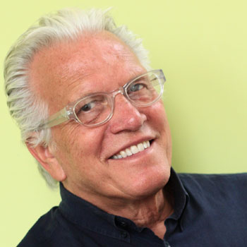 Thomas Balsley, FASLA / Thomas Balsley Associates
Last year, during Hurricane Sandy, Hunter’s Point South, your new park in Long Island City, Queens, was submerged under four feet of water as it was being constructed. Amazingly, the park survived this first test and drained as it was designed to. How did you and your design partners prepare for this? How is this a new model for dealing with climate change and improving resiliency?
The park has a purpose beyond resiliency, but we believe it’s a new model for 21st century urban parks in all respects. Sustainability underpinned the design approach right across the board, from the environmental and ecological to the social, economic, and cultural. Hunter’s Point South Park is a design collaboration between Thomas Balsley Associates and Weiss/Manfredi.
Part of our job when we work anywhere near the shores is to anticipate the effects of global warming, the storm surges. We had co-designed Gantry Plaza State Park and the whole Queens Park master plan prior to this park, so we had a chance to study that site and understand the East River. Gantry Plaza State Park was not affected to the extent others areas were hit by Sandy, but waters had breached the top of the bulkhead walls and the piers, so flooding was already on our minds.
At Hunter’s Point South, as we did at Gantry Plaza State Park, we started with the idea that these were at one time industrial sites; there was rail use in this case. Our approach was committed to conveying a message, a subliminal message of toughness and ruggedness, not preciousness. I don’t know what parallel to draw, but some projects we all love and admire are really precious to the point where they have a fragility to them. We purposely wanted this park from the very beginning to be muscular, to reflect its blue-collar, industrial history, and that of its upland community.
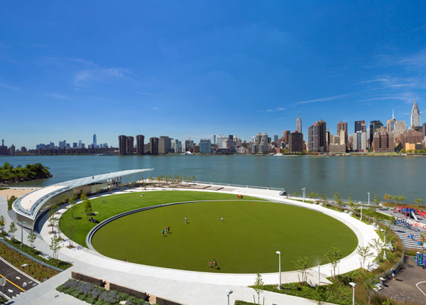 Hunter's Point South / © Albert Večerka/Esto
With these rugged materials and detailing, we were way ahead of the game in terms of resilience. Because the river is actually a tidal body with strong currents of saltwater, we avoided catchment areas that might catch surges and hold them. Long-term exposure to the saltwater can be pretty harmful, so the park had to drain itself, with water eventually finding its way back out over to the river as the waters receded.
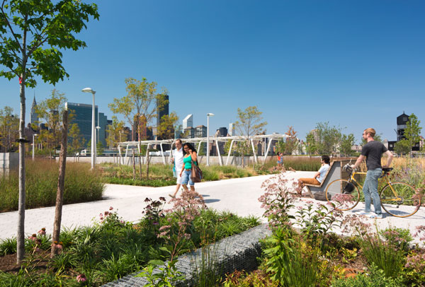 Hunter's Point South / © Albert Večerka/Esto
Obviously, the employment of native plant material was important, too. We had a very tight budget, so there was no chance of using automatic irrigation, even with recycled water. It just wasn’t going to happen, so we focused on low-water use native plants that have proven themselves along the shorelines of local saline rivers. The park's plant palette was purposely selected to be resilient, low maintenance, and provide visual integrity.
Hunter's Point South is really just one of a hundred parks and plazas in New York City you have designed over your decades-long career. The one that really leapt out at me, among many, was the Gantry Plaza State Park. Why was that so successful?
I referred to this park earlier when we were talking about Hunter’s Point South because that’s the next park component along the east shore of the Queens side, the Long Island City side, but it was done 20 years earlier. Gantry Plaza State Park was important to us as individual designers, but it was also, in our minds, really important for the future waterfront development of New York.
It’s hard for people to imagine now, but 30 years ago, NYC was probably one of the most conservative places to practice the art of landscape architecture in the country. During that same period you couldn’t have found a notable building being built in New York City either. The city had horrible fiscal and safety troubles, which made it very conservative and fearful. There just wasn’t courage or the will on the private or the public side to go out and take chances. There wasn’t a contemporary landscape precedent to be able to point to that would have said, “See? We can do this.”
Well, something happened 30 years ago, not with public money, but over at Battery Park City. It was a new model of urban planning. The developers were ingenious in securing public approvals. Battery Park introduced the notion that you can build parks first and then develop the parcels. To get this approach approved, the designers strategically harked back to New York at the turn of the century. The character of a park promised New Yorkers wouldn’t be controversial. Everyone said, “Oh, that’s great. We like that period.” It was that kind of climate. [30 years ago there was some of us saying, “I promise. I’ll make it look just like Central Park if you just let me out of this room because it’s one o’clock in the morning.”] So the Battery Park City Authority had private money behind it in the form of bonds. They had a very good tactic for getting a design approved. When it was built, Battery Park was pointed to as the great urban waterfront success and the “latest and the greatest” of waterfront park design.
But there is also a problem that comes with those successes: the next client asks you to do one just like it. When our team of Thomas Balsley Associates and Weintraub di Domenico was commissioned to design the Queens West Parks, the approved park plan was promising another Battery Park City across the river in Long Island City.
After its approval, a new client was brought in who decided, maybe from past experience from working with us, that they wanted something different. She said, “we’re going to do something innovative. We’re going to show New York how to take the next step.” So we had a client that encouraged us to do just that and we rushed through that door of opportunity. As The New York Times architecture critic wrote of the park at the time, “the curse has been broken.”
At Gantry Plaza State Park, we were doing things there that were unheard of in New York. Number one: don’t fill, use and celebrate the diverse shoreline. Number two: don’t erase history, celebrate history and culture. Number three: make it a blue collar place, not a corporate downtown place. Make it look like it doesn’t have money, like it’s a real park for real people.
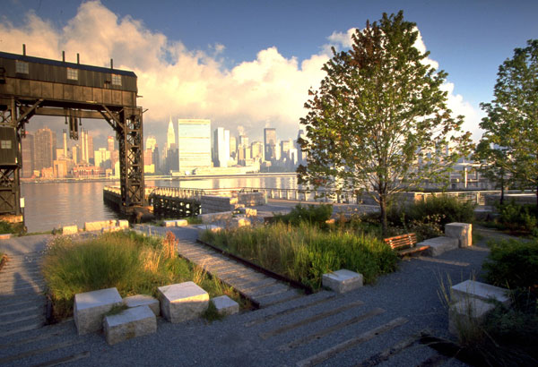 Gantry Plaza State Park / Betsy Pinover Schiff
Gantry Plaza State Park demonstrated that we can celebrate history, heritage, culture, and, at the same time, express the future with contemporary design. That’s why that park is so special to us. It became the new paradigm for 21st century waterfront parks, the park everyone pointed to in New York and said, “Let’s make all the rest of our waterfronts like this.” I can take you around the shoreline now and you will see that Gantry Plaza State Park ideas have found their way in other places. And it really launched a whole new era in landscape architecture in New York.
Many of those hundred urban parks and plazas you've designed are small privately-owned public spaces (POPS). You have often said these places are unloved. Why?
POPS used to be called bonus plazas. Plazas have been stigmatized as the receptors of all of society’s misfits and ills, so it’s no surprise that our profession hasn’t embraced them. NYC POPS were considered “dirty”, because you were doing work for developers, not the public sector. Until recently, NYC landscape architects treated them like they are lepers. They didn't want anything to do with them. As a result, some 95 percent of POPS in New York City are designed by architects. Taken together, there are 84 acres of POPS in Manhattan alone.
These are a great untapped opportunity for landscape architects to touch millions of lives, yet, for the most part, these chance have been squandered by the local professionals. I’m proud to have done more than anyone and get a great deal of satisfaction as I pass by and do my Holly Whyte analysis.
Heritage Field at Yankee Stadium is another fantastic community asset you've designed. The park takes the history and makes something contemporary, but on top of that, the park is so many different things at once. It’s a place for locals to play ball, a park, a playground, a conduit from the subway station, the stadium. So how did you get all those things to fit within one design?
That’s the classic 10-client pound program for the 5-pound bag, isn’t it? Of course, we had to find a way. The politics behind that project were extraordinary. Most people don’t realize that Yankee Stadium was in a New York City park. And the Yankees are basically saying, "we’re going to take part of the park next door to build a new stadium." You could tell that’s got a little bit of a problem flying, especially with locals. The team of Thomas Balsley Associates and Stantec had to come up with a strategy that downplayed the existing stadium and history and transformed it into a community park with a landscape narrative.
Our goal was to get all these programs into the space, but at the same time make it look like it was ball fields that had been carved out of parkland. We wanted the edges to be lush native grasses and the plantings and to manage and filter stormwater. That’s unlike most active recreation areas you’ll find, especially in a tight, urban setting in which you’ll normally see a fence, and maybe a hedge. We kept insisting that within the park there was enough space for those in the Bronx to feel like that this was the parkland they had once been promised. It’s a very big part of the character and the feeling you get as you walk through the spaces or to the new stadium.
One of your older projects that I was very interested in was your work on the Columbia University campus. Can you tell me about what you achieved with that planning project, which involved trying to get the newer parts of the campus to look more like the historic center? What has happened since then? How has it evolved there?
Getting the newer parts to be part of the original was certainly one of the goals, but the bigger challenge was that the McKim, Mead, and White-designed campus never had a landscape master plan. It had an architectural master plan, but it never had a landscape master plan. In our historical research we even found some records of when the president of Columbia University was reluctant to buy into the McKim, Mead, and White urban campus vision, because it wasn’t a leafy Princeton-like campus. Your client may say, “Yes, that’s what we want, an urban campus." But, once they saw renderings of just buildings and barren landscape, then they started to get a little worried.
They asked to bring in Olmsted to comment. He never did any work on the campus but he cited an example of going in the forest and encountering a pine stand, just pure pine and pine needle, and maybe the wind whistling. I’ll never forget this observation because it inspired another piece of work I did called the Pine Forest at 101. And it’s almost a religious experience to be in that place. It’s almost Zen-like. It’s not asking you to look around for visual stimulation. So he had a little bit of an influence, in getting that campus master plan approved.
But it became very clear over the years that it had a certain sterility to it, at least to the mainstream. Campuses suffer because they get $100 million donations to build a new building but not new landscapes. They needed a campus landscape master plan, a vision for a landscape donor.
The goal of the project was to adapt the historic campus landscape, movement systems, social systems, to 21st-century culture of campus life. Then we wrote a very strict set of design guidelines. Your building, your $100 million donation, will have to follow these. We’re also going to take a little bit of money for the overall campus landscape. As the university expands or improves on the Morningside campus, they’ll have uniformity and integrity.
Going overseas where you’ve also done a lot of work, I was struck by your projects in Japan. Two really exciting ones for me were the World Trade Center in Osaka and the Kasumigaseki Plaza in Tokyo. These plazas boldly emphasize color and form, but you also describe these places as responding to the tall buildings and kind of countering them. Can you talk about how you humanized those spaces around these huge buildings?
We’re all faced with that when we’re working in an urban setting, especially with high-rise projects. Humanizing space is part of what we all do. We’re very much social-space designers, not just space designers. These parks are in an urban setting and require a delicate balance between their urbanity, their urban context, and the individual.
There must be a hierarchy of space that helps strike this balance. There has to be a large space to reflect that urban scale and yet be flexible enough to accommodate different uses that we haven’t yet anticipated, concerts, festivals, etc., yet be accessible for daily enjoyment.
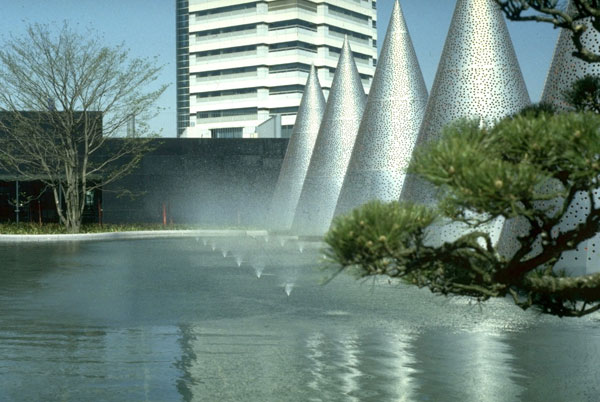 World Trade Center, Osaka, Japan / Thomas Balsley Associates
Movement systems and program frame the larger space, creating a network of other spaces that vary in scale and character -- from me and my co-workers having a conference, to just you sitting in a corner reading your book. All these smaller spaces must have good sight lines to the street, which is a lesson from New York. These are but a few approaches we’ve applied throughout the U.S., and now abroad in our urban place-making.
Thomas Balsley, FASLA, is the founder and principal of Thomas Balsley Associates, a firm he has run for 35 years. Balsley has taught and lectured at Harvard’s Graduate School of Design, the University of Pennsylvania, the National Building Museum, and Seoul National University.
This interview was conducted by Jared Green at the ASLA 2013 Annual Meeting in Boston.