Award of Excellence
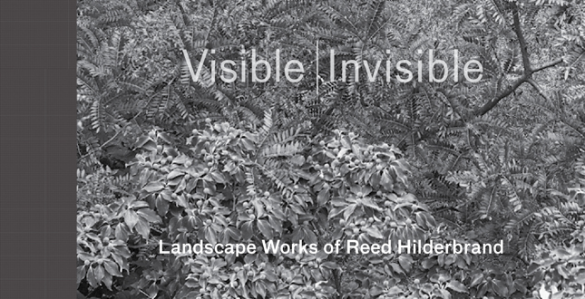
Visible | Invisible: Landscape Works of Reed Hilderbrand
Reed Hilderbrand, LLC, Watertown, MA
Publisher: Metropolis Books
 Close Me!
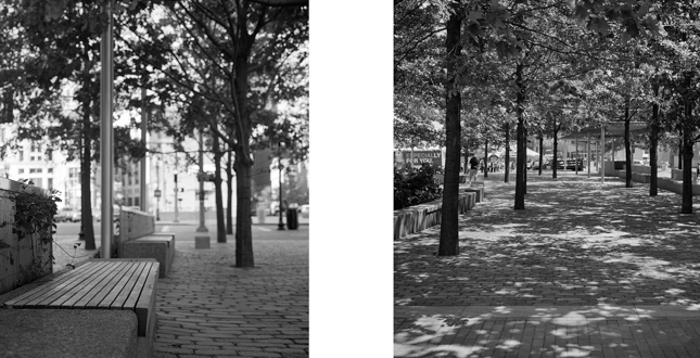
Left: Central Whart Plaza
Right: Central Wharf Plaza
Download Hi-Res ImageImage: Millicent Harvey
Image 6 of 15
 Close Me!
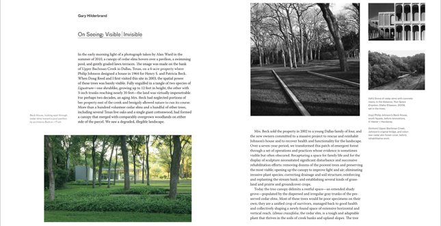
Left: Beck House, looking east through cedar elms toward a pool pavilion by architects Bodron & Fruit.
Middle: Grove of cedar elms with concrete risers, in the distance. Your Space Eruption, Olafur Eliasson, 2009. Set in the trees.
Top Right: Philip Johnson's Beck House, south façade, before renovations. ©Hester + Hardaway.
Bottom Right: Upper Bachman Creek, Johnson's original bridge, and volunteer cedar elm forest cover, before rehabilitative work
Download Hi-Res ImageImage: Alan Ward (104), Reed Hilderbrand (105 lower right), Millicent Harvey (105 left),
Image 7 of 15
 Close Me!
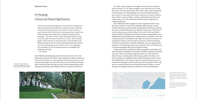
Left: Greenlee House, in Dallas, Texas, designed by Edward Larabee Barnes and completed in 1981. Walls, terrace, and planting were developed by Reed Hilderbrand in 2010.
Right: Baton Rouge International School contextual drainage diagram, by Trahan Architects and Reed Hilderbrand.
Download Hi-Res ImageImage: Alan Ward (116)
Image 8 of 15
 Close Me!
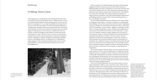
On Making Tectonic Clarity
A footbridge fitted to existing trees marks the beginning of the woodland trail network at The Clark.
Download Hi-Res ImageImage: Reed Hilderbrand
Image 9 of 15
 Close Me!
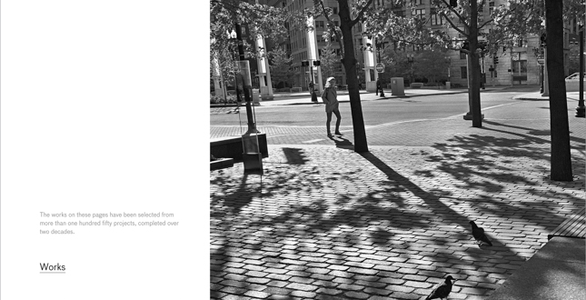
The works on these pages have been selected from more than one hundred fifty projects, completed over two decades.
Download Hi-Res ImageImage: Alan Ward
Image 10 of 15
 Close Me!
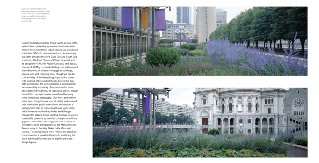
The First Church of Christ, Scientist.
Our work transformed annuals plantings into a four-season garden and, to improve canopy health and long-term viability, altered the pruning regimes on the original aerial hedge. Download Hi-Res ImageImage: Alan Ward
Image 11 of 15
 Close Me!
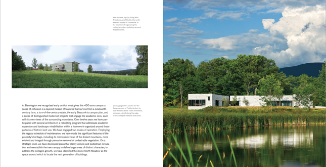
Bennington College
Left: New Houses, by Kyu Sung Woo Architects, are fitted to the north-western slopes of a meadow, in the tradition of organizing the college's modern buildings around Academic Hill.
Right: The Center for the Advancement of Public Action, by Tod Williams Billie Tsien Architects, occupies a knoll along the edge of the college's meadow and pond.
Download Hi-Res ImageImage: Reed Hilderbrand (168), Michael Moran (169)
Image 12 of 15
 Close Me!
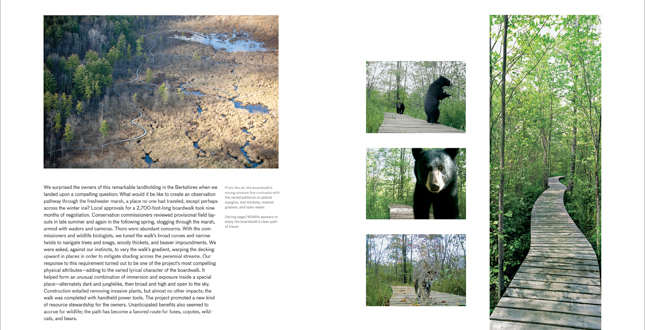
Half-Mile Line
Left: From the Air, the boardwalk's strong sinuous line contrasts with the varied patterns of upland margins, wet thickets, matted grasses, and open water.
Right: Wildlife appears to enjoy the boardwalk's clear path of travel.
Download Hi-Res ImageImage: Alex MacLean (206), David M. Smith (207 all left), Andrea Jones (207 right)
Image 13 of 15
 Close Me!
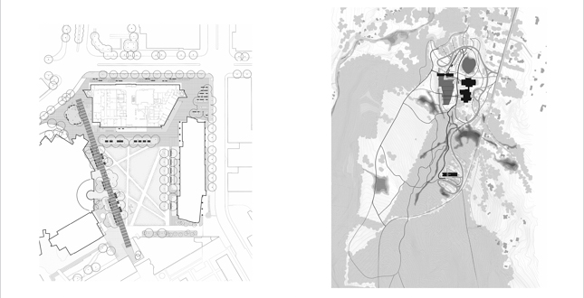
Left: MIT North Court and Main Street.
Right: The Clark
Download Hi-Res ImageImage: Reed Hilderbrand
Image 14 of 15
Project Statement
Visible | Invisible explores the preoccupations, influences, themes, and challenges that shape how the principals and designers at Reed Hilderbrand reflect on their work. In contrast to the recent tendency to illustrate conceptual depth through diagram, three-dimensional illustration, and process drawings, this book relies on photographic representations of built work—through the interpretive lens of an artist and through plan drawings—to evidence consistency in approach and outcome. The result is an expository work that speaks of values, convictions, and aspirations toward humanistic achieve
Project Narrative
—2013 Professional Awards Jury
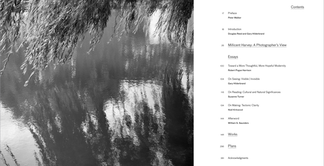
Visible | Invisible investigates the work of Reed Hilderbrand in the firm's own words and through the words and images of outside observers. In his preface, landscape architect Peter Walker praises the contributions of the firm to what he terms “the third wave of modernism.” And in a first-person introduction Hilderbrand and Reed reflect personally on the firm's twenty-year evolution. These introductory texts are followed by an extensive photographic essay by Millicent Harvey, a meditation on themes she has discovered through her own process of occupying and documenting sites on which the firm has worked. At the heart of the book, five essays develop specific themes drawn from the body of work and that are elaborated by examining aspects of the firm's completed projects. Robert Pouge Harrison, who has written on the theme of the garden in classical literature, frames the essays by considering the significance of the built landscape in contemporary society. Three primary essays approach the work from unique and complementary angles: Hilderbrand's “On Seeing,” Suzanne Turner's “On reading,” and Niall Kirkwood's “On Making.” The essays consider historical and disciplinary frames, the cultural and ecological context of the work, and processes of conceiving and building projects. William Saunders concludes the essays with an appreciation of the humanity in the work and a positioning of the firm within contemporary practice.
Nearly forty works were selected, from over one hundred fifty projects completed over two decades, to be described in color photography. Short texts elaborate upon the ideas, interests, and motivations that led to the specific realizations illustrated in the images. The juxtaposition of this section with Millicent Harvey's black and white portfolio reveals the firm's continual search, within the limitations of a two-dimensional medium, to find better ways to convey a living, dynamic work of landscape architecture.
A collection of sixty full-page plans presented together as a body of work concludes the book. The decision to separate essays, black and white photography, color photography, and plan drawing into distinct components elaborates on the premise that it is not the individual projects that reveal the most about the firm but that consistency and clarity of vision is best seen across the work when viewed from alternate points of view.
Following are excerpts from selected portions of the text:
Introduction
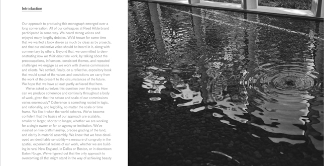
Our approach to producing this monograph emerged over a long conversation. All of our colleagues at Reed Hilderbrand participated in some way. We heard strong voices and enjoyed many lengthy debates. We'd known for some time that we wanted a book driven as much by ideas as by projects, and that our collective voice should be heard in it, along with commentary by others. Beyond that, we committed to demonstrating how we think about the work, by talking about the preoccupations, influences, consistent themes, and repeated challenges we engage as we work with diverse commissions and clients. We settled, finally, on a reflective, expository book that would speak of the values and convictions we carry from the work of the present to the circumstances of the future. We hope that we have at least partly achieved that here.
Millicent Harvey: A Photographer's View
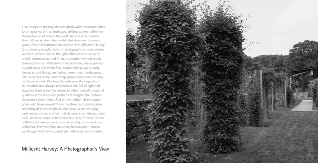
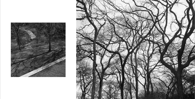
In recent years, Reed Hilderbrand has worked with Millicent Harvey to produce a singular body of photographs on sites where we have worked. The firm has approached this enterprise as an artist's commission, and it has proceeded without much steering from us. Millicent's interpretations, made primarily with black and white film, are presented here as a collection. The choice to feature black and white photography of landscape architecture works is an unusual one in this day and age, and is a distinguishing characteristic of this monograph. With Millicent's guidance, we have found new ways of seeing in the beautifully distilled light and shadow of her images. Her work has made our landscapes—places we thought we knew exceedingly well—ever more visible.
Plans
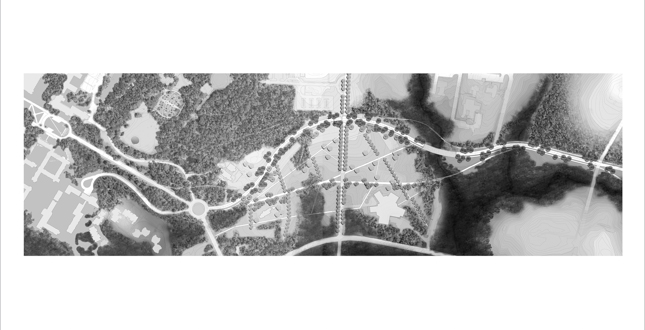
Our interest in drawing plans that embody the primary site influences and ideas behind the work is manifested here in 60 plans of works from the last two decades. The plan is an ancient device that, in landscape architecture, embodies an irrefutable conceit. It's a time-stopped view that describes the world partly as it exists, partly as envisioned. Whether depicting our interventions and their contexts on small sites or many city blocks or hundreds of acres, the plan, in its comprehensiveness carries the unrealistic burden of representing too many conditions; what counts for us is deciding which things to emphasize so that we convey something of the ideas in the work itself.
The book is intended for a broad audience of designers and technical professionals—landscape architects, architects, engineers, and students—as well as photography devotees, gardeners, builders, preservationists, historians, and academics. The firm's trajectory makes the book an important reference work in the field, and it is intended that other professionals will see it as a source for ideas, precedents, and techniques.
The book was organized by Constance Sullivan and designed by Bethany Johns, who is Graduate Program Coordinator in Graphic Design at RISD.
The firm elected to print at Meridian Press in East Greenwich, Rhode Island, a publisher of art books for museums and galleries to ensure the highest quality photographic reproductions. This allowed working closely with the publisher from design to press run. It is hardcover, 9.25 in. x 11 in., 376 pages, 200 color, 100 duotone.
It was officially published 31 January 2013 by Metropolis Books and is distributed by Artbook | D.A.P.
Project Resources
Lead Designer
Douglas Reed, FASLA, and Gary Hilderbrand, FASLA, authors
Eric Kramer, ASLA
Sarah Vance, ASLA
Paul Weiner
Jeri Stedt
Tamara Taylor
Alison Hlivak
Preface
Peter Walker, FASLA
Introduction
Douglas Reed, FASLA and Gary Hilderbrand, FASLA
Portfolio
Millicent Harvey
Essays
Robert Pogue Harrison
Gary Hilderbrand, FASLA
Suzanne Turner, FASLA
Niall Kirkwood, FASLA
Afterword
William S. Saunders, Affiliate ASLA
Editor
Eric Kramer, ASLA
Producer
Constance Sullivan
Book Designer
Bethany Johns
Copy Editor
Archie Hobson
Printer
Meridian Printing
Bindery
Riverside Bindery
Publisher
Metropolis Books


